From Dev to Deploy: Visualising Developer Friction Points Using DevOps Metrics

Published on 24 June 2025 by Zoia Baletska
Software development isn’t just about writing code – it’s about moving that code efficiently from idea to deployment. But too often, friction hides inside our DevOps pipelines, slowing teams down and frustrating developers. These bottlenecks rarely show up in a dashboard, and when they do, they’re hard to connect to real developer pain.
The solution? Use DevOps metrics to visualise friction points from Dev to Deploy – and take action before velocity and morale drop.
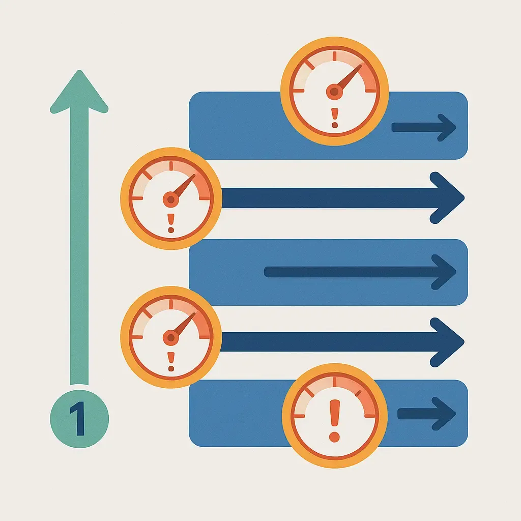
Where Friction Hides in the Delivery Lifecycle
From the moment a developer picks up a ticket to the moment the feature hits production, multiple stages create invisible drag:
-
Unclear requirements delay the start of development.
-
Long PR review times leave engineers idle or context-switching.
-
Unstable environments trigger failed tests and rebuilds.
-
Manual approvals stretch lead time without adding value.
-
Tool fragmentation forces devs to jump between systems, killing flow.
The frustrating part? Most teams track velocity, but not the friction that erodes it.
Mapping Metrics to Developer Pain
By combining traditional DevOps metrics with developer sentiment and workflow data, you can start to surface and quantify pain points. Here's how:
Friction Point
Slow reviews
Test bottlenecks
Rework after deploys
Excessive wait states
Tool overload
Metric to Watch
Time to Merge, Review Depth
Build Failure Rate, Test Flakiness
Change Failure Rate, Hotfix Volume
Lead Time for Changes, Handoff Delays
Context Switch Frequency, Survey Data
Insight it Offers
Are developers waiting too long for feedback?
Are unreliable tests slowing down confidence?
Are features getting rushed without safeguards?
Where is the delivery chain breaking down?
Are devs jumping between too many tools or systems?
Using platforms like Agile Analytics, you can correlate operational data (like DORA metrics or CI/CD stats) with team feedback to pinpoint exactly where delivery slows down – and why.
Visualisation = Actionable Insight
Friction metrics on their own aren’t enough. You need to visualise them clearly, in a way that matches the dev lifecycle. That means:
-
Flow diagrams showing lead time from commit to deploy
-
Swimlanes for PR and testing phases
-
Scorecards for self-service platform adoption
-
Heatmaps of engineering satisfaction across teams
With these views, engineering leaders can prioritise the right improvements, not just for pipeline performance, but for developer wellbeing.
Make Friction Visible Before It Becomes Failure
Developer friction isn’t always obvious in failed builds or downtime. It builds slowly through delays, inefficiencies, and burnout. If your metrics only show outcomes, not experience, you're missing the real picture.
By visualising friction from Dev to Deploy, you turn metrics into insight – and insight into action.
Agile Analytics helps DevOps and platform teams link technical metrics to the developer experience, unlocking faster delivery cycles, happier teams, and smarter investments.
Supercharge your Software Delivery!
Implement DevOps with Agile Analytics
Implement Site Reliability with Agile Analytics
Implement Service Level Objectives with Agile Analytics
Implement DORA Metrics with Agile Analytics