SLO Dashboards That Tell a Story: What to Visualise — and What to Avoid

Published on 19 February 2026 by Zoia Baletska
Most SLO dashboards answer a single question: “Did we meet the SLO?” Unfortunately, that’s also the least useful question you can ask.
A green checkmark tells you nothing about risk, trend, or impact. It doesn’t explain whether reliability is improving or eroding, whether teams are operating safely within their error budgets, or whether upcoming releases are putting customer experience at risk.
Great SLO dashboards don’t just report compliance. They tell a story — one that helps engineering, product, and leadership make better decisions.
This article explores how to design SLO dashboards that do exactly that.
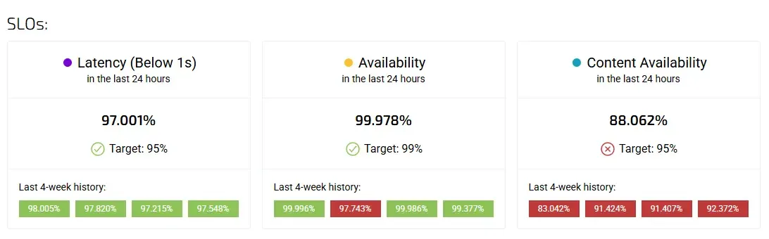
The problem with “SLO met / not met”
Binary SLO dashboards are comforting. They are easy to read, easy to present, and easy to misunderstand.
When teams reduce reliability to a red or green state, several things happen. First, early warning signals disappear. A service that barely meets its SLO looks identical to one that exceeds it comfortably. Second, conversations become reactive. Teams only pay attention after a breach, rather than understanding whether they are drifting toward one. Third, SLOs become disconnected from business decisions — because they lack context.
The result is a dashboard that looks healthy while risk quietly accumulates underneath.
If your SLO dashboard can only tell you what already happened, it’s not doing its job.
SLO dashboards should show movement, not status
The most important shift in SLO dashboard design is moving from status-based views to trend-based narratives.
Reliability is not static. It degrades, recovers, stabilises, and fluctuates over time. Dashboards should reflect that reality. Instead of focusing on whether an SLO was met in the last window, teams should be able to see how close they are to the boundary, how fast they are consuming error budgets, and whether things are improving or getting worse.
A well-designed dashboard makes it obvious when a service is healthy but fragile — or technically compliant but trending toward danger.
This is where the distinction between leading and lagging indicators becomes critical.
Leading vs lagging indicators: seeing trouble before it hits users
Lagging indicators tell you that something has already gone wrong. SLO breaches, incidents, and customer complaints all fall into this category. They are necessary, but insufficient.
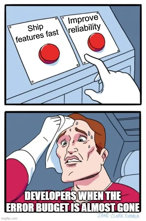
Leading indicators, on the other hand, reveal risk before failure occurs. In the context of SLOs, these often include error budget burn rate, volatility in latency or availability, deployment frequency during high burn periods, and increasing variance in key SLIs.
For example, a service might still be within its SLO target, but consuming its error budget twice as fast as usual. That’s not a failure — it’s a warning. A dashboard that highlights this pattern allows teams to slow releases, investigate regressions, or prioritise reliability work before users are affected.
The best SLO dashboards place leading indicators at the centre of the story, with lagging indicators providing confirmation rather than surprise.
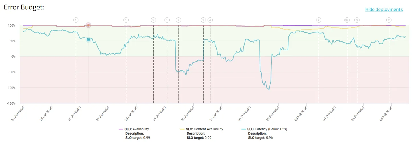
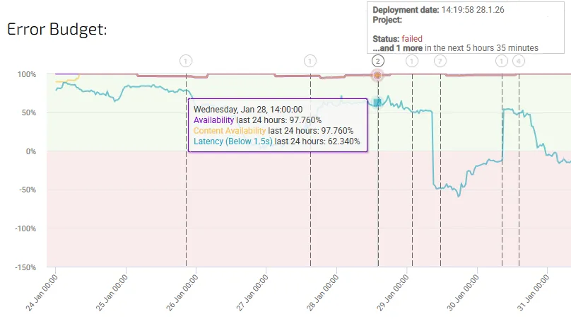
Error budgets as a narrative device
Error budgets are often presented as a percentage or a remaining number. That’s a start, but it’s not enough.
In a storytelling dashboard, error budgets act as a timeline of risk. They show not just how much budget remains, but how it is being consumed, when it was consumed, and what changed around those moments.
When error budget consumption is visualised alongside deployments, traffic spikes, or architectural changes, patterns emerge. Teams can see which types of changes tend to increase risk and which ones stabilise the system. Over time, this turns the dashboard into a learning tool rather than a compliance report.
This is also where SLO dashboards begin to influence decision-making. When teams understand how close they are to the edge — and why — error budgets naturally become part of planning conversations, not just post-incident reviews.
Connecting SLOs to business impact
One of the biggest missed opportunities in SLO dashboards is the lack of connection to business outcomes. Reliability is rarely the goal in itself. It is a means to protect revenue, retain customers, and preserve trust.
An SLO breach without context feels abstract. An SLO breach correlated with checkout failures, increased churn, or lost transactions tells a very different story.
Effective dashboards don’t try to directly calculate “money lost per outage” — that often leads to false precision. Instead, they correlate reliability signals with business indicators. When latency spikes coincide with conversion drops, or availability dips align with increased support tickets, teams can clearly see why SLOs matter.
This kind of correlation also changes how SLOs are perceived by non-engineering stakeholders. Instead of being seen as technical constraints, they become visible safeguards for business health.
Avoiding vanity metrics that dilute the story
One of the fastest ways to ruin an SLO dashboard is to overload it with metrics that look impressive but add little insight.
Vanity metrics are particularly dangerous because they create the illusion of control. Uptime percentages rounded to multiple decimals, raw request counts, or global averages across unrelated services all fall into this trap. They are easy to measure, easy to present, and rarely actionable.
A good rule of thumb is simple: if a metric doesn’t change a decision, it doesn’t belong on the dashboard.
SLO dashboards should be opinionated. They should prioritise clarity over completeness, and signal over noise. Every metric included should answer a specific question: Are we at risk? Why? And what should we do about it?
Anything else belongs in raw observability tools, not in decision-facing dashboards.
Designing dashboards for conversations, not reporting
Perhaps the most important mindset shift is recognising that SLO dashboards are not reports. They are conversation starters.
A well-designed dashboard naturally prompts questions:
-
Why did error budget burn accelerate here?
-
What changed in this period?
-
Should we slow down releases?
-
Is this risk acceptable given current business priorities?
When dashboards are built for storytelling, teams stop using them only in postmortems or quarterly reviews. They become part of weekly planning, release discussions, and cross-functional alignment.
This is where SLOs stop being abstract reliability targets and start becoming tools for governance, prioritisation, and trust.
From numbers to narrative
SLO dashboards that merely report compliance miss the point. Reliability is not binary, and neither are the decisions teams need to make.
The most effective dashboards tell a story over time — one that combines leading indicators, error budgets, and business context to show not just what happened, but what’s likely to happen next.
When teams can see risk forming, understand its impact, and act early, SLOs finally deliver on their promise: not as metrics to hit, but as tools to guide sustainable, user-focused engineering.
At Agile Analytics, this philosophy underpins how we approach SLOs, dashboards, and engineering metrics — not as static reports, but as living systems that support better decisions.
Supercharge your Software Delivery!
Implement DevOps with Agile Analytics
Implement Site Reliability with Agile Analytics
Implement Service Level Objectives with Agile Analytics
Implement DORA Metrics with Agile Analytics