The Hidden Metrics Agile Teams Miss (And Why Velocity Alone Isn't Enough)

Published on 4 June 2026 by Zoia Baletska
Your sprint dashboard shows 85% of story points completed. The burndown chart looks healthy. But features still miss deadlines. Tech debt grows. Your team is exhausted. What's wrong?
You have data everywhere — Jira is full of it, dashboards track everything, retrospectives are always scheduled. Yet somehow, you're drowning in visibility but starving for insight.
Here's the uncomfortable truth: Most agile teams are measuring the wrong things. And the metrics they trust most are lying to them
The Problem: You're Optimising for Vanity
Agile methodology tells you how to work — sprints, standups, retros, iterations. But it doesn't tell you what to measure to improve. So teams default to the easiest metric: velocity.
Velocity feels scientific. It's objective. It trends nicely in charts. Everyone understands "story points per sprint."
But velocity is solving the wrong problem. It measures activity, not progress. It can mask unsustainable practices. It breaks down with interrupts, dependencies, and rework. And worst of all, it hides the real bottlenecks that are actually slowing you down.
We've worked with dozens of agile teams. The pattern is always the same: velocity looks good while everything else falls apart.
The solution? Stop chasing velocity. Start measuring what actually predicts success.
Blind Spot #1: The Velocity Trap
Let me walk you through a scenario. Your team's velocity is 40 story points per sprint. Looks consistent, right? But what does that 40 really mean?
Scenario A: Your team estimates conservatively. 10 small, well-defined features. Four days of focused development. Real output: 10 deployed features, 200 lines of tested code, zero production bugs.
Scenario B: Your team estimates aggressively. Same velocity of 40 sp, but it comes from: 15 sp of quick fixes, 20 sp of shortcuts (limited testing), 5 sp that got partially done but shipped anyway. Real output: 8 features, high technical debt, 3 production bugs in the next sprint.
Same velocity. Completely different reality.
Here's what makes this worse: Velocity can increase while productivity decreases.
If your team rushes, cuts corners, and skips testing, velocity goes up. In the short term, it looks amazing. In a few sprints, defects and rework surface, and suddenly velocity collapses. You've optimised yourself into a corner.
What You're Actually Missing
The metrics that matter:
-
Actual throughput — How many features genuinely shipped to users? (Not story points, actual business value)
-
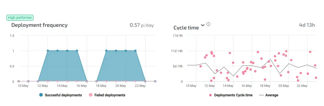
Cycle time — How long did that feature take from "we agreed to build it" to "users are using it"?
-
Flow efficiency — What percentage of that cycle time was actual work versus waiting?
-
Quality signals — Is code quality keeping up, or are you trading quality for velocity?
Without these, you're flying blind. You're measuring how many story points your team estimated they'd complete, not what they actually delivered.
The Quick Win
Start this week: Track throughput (features, commits, deployments per sprint) alongside velocity. If velocity is up but throughput is flat — congratulations, you've just discovered estimation inflation. Your team isn't working smarter; they're estimating higher.
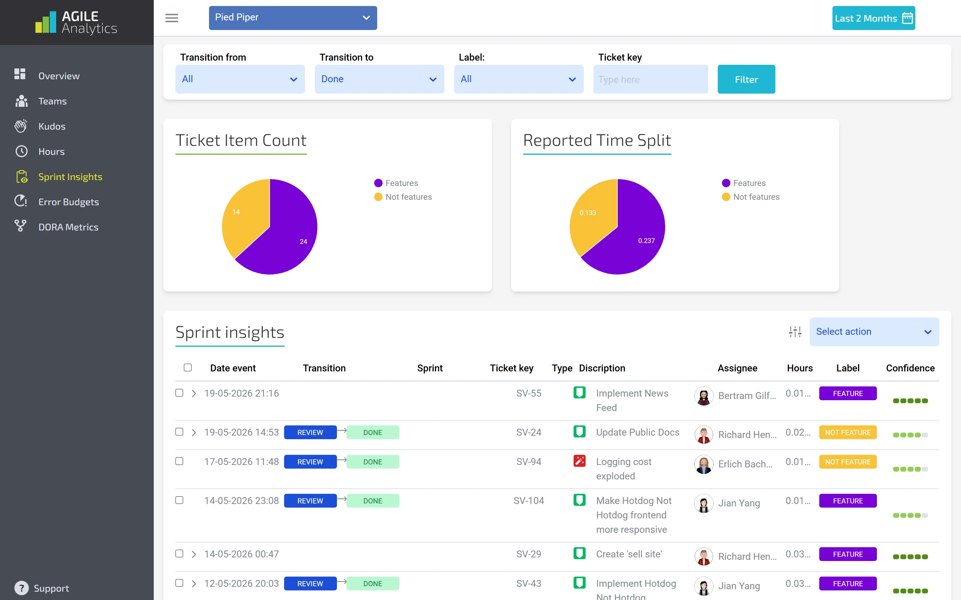
Sprint Insights in Agile Analytics
If throughput is up but your team looks exhausted — you've found an unsustainable velocity.
Blind Spot #2: The Visibility Gap
Your Jira board looks comprehensive. Every ticket is tracked, every state is documented, and every sprint is planned. But Jira doesn't track context. It tracks tasks.
Let's say your sprint shows: 20 tickets closed today, burndown looks great. But it doesn't show:
-
Were those developers interrupted? By what?
-
Did closing those tickets create dependencies for another team?
-
Was there rework buried in "closed" (reopened next sprint as a bug)?
-
How much time was spent waiting — code review, QA approval, deployment window — hidden in that "in progress" status?
Most teams have no visibility into the actual capacity available for planned work. You think you have 40 story points of capacity. The reality looks more like:
-
10 sp to unplanned production incidents
-
5 sp absorbed by dependency blockers (waiting on infrastructure, database team, etc.)
-
5 sp lost to context switching and interrupts
-
3 sp of rework from previous sprints
-
2 sp spent on support tickets and urgent requests
Real available capacity: 15 sp. Planned capacity: 40 sp.
So you plan for 40, close 15, and the team feels like failures. But they're not. The goal changed halfway through.
What You're Actually Missing
-
Interrupt tracking — How much unplanned work hit the sprint? (Support tickets, production incidents, urgent requests)
-
Dependency visibility — Which tickets are blocked on other teams? (Invisible until sprint ends)
-
Quality metrics — Rework rate (% of tickets from last sprint that came back as bugs)
-
Capacity accounting — Meetings, code review, mentoring — what % of time actually goes to sprint work?
Most teams don't measure these. So when sprints miss, they blame "discipline" or "unclear requirements." But the data tells a different story.
The Quick Win
Add one custom Jira field this week: "Type of Work" with values: Feature, Bug, Support, Tech Debt, Interrupt.
Tag everything as it arrives. At the end of the month, run a report: "X% of our capacity went to unplanned work."
Now you have data to adjust sprint planning. Instead of assuming 40 sp available, you can plan for 40 minus the average unplanned work you actually see.
One small change. Massive credibility gain.
Blind Spot #3: The Forecasting Illusion
Every sprint planning meeting starts the same way: "Based on our velocity of 42 story points, let's commit to 42 story points." This is a point forecast. A single number. As if the future is predictable.
In reality, your last 10 sprints looked like: 38, 45, 40, 42, 35, 48, 39, 44, 36, 46 sp. That's a 30-point range. But you're committing to 42 as if it's certain.
Here's what happens:
-
You commit to 42
-
60% of the time, you hit it (luck, good timing)
-
40% of the time, you miss it (dependencies delay, more rework, interrupts)
Team feels like failures 40% of the time, even though they're delivering consistently
The fundamental problem: Forecasts without confidence intervals are just guesses with a false sense of certainty. You need to forecast like a meteorologist. Not "it will be 72 degrees," but "72 degrees with a 30% chance of rain and a range of 68-76 degrees."
What You're Actually Missing
-
Velocity confidence intervals — "We're 80% confident next sprint will be 38-48 sp" (not just "42")
-
Scope tracking — How many items get added mid-sprint? (If it's more than 20%, you have a scope management problem)
-
Dependency forecasting — Which sprints will have external blockers? (Plan accordingly)
-
Risk modelling — What's the probability we hit our delivery date if velocity varies, scope creeps, and dependencies pop up?
Without this, your forecasts are theatre. You look professional presenting a date, but you're not actually confident.
The Quick Win
Calculate the velocity standard deviation for your last 8-12 sprints. Use that range as your forecast, not a single point.
Example: Average velocity 40, standard deviation 5. Your next sprint forecast isn't "40 sp" — it's "80% confidence we'll hit 35-45 sp."
That single change destroys false certainty and makes your forecasts honest. Leadership will actually trust them more because you're not constantly surprising them.
Blind Spot #4: The Sustainability Blind Spot
Velocity is trending up. 38, 40, 42, 44 sp per sprint. The team is accelerating!
Except they're also: Working overtime. Cutting code review time. Skipping tests. Shipping with lower test coverage. Rework is increasing. You've optimised for velocity at the cost of sustainability.
Here's the timeline:
-
Month 1: Velocity up, team feels good
-
Month 2: Velocity still up, but quality issues start appearing (defects in production)
-
Month 3: Rework consumes the sprint, and new feature velocity collapses
-
Month 4: Team is burned out, key person quits
All predictable. All is visible in the data. But no one was measuring it.
When you only track velocity, you can't see the debt accumulating. You can't spot quality declining. You can't tell if the team is sustainable or just riding a high that will crash.
What You're Actually Missing
-
Defect escape rate — Bugs found in production per feature shipped (trending up = unsustainable)
-
Rework rate — Tickets from previous sprints reopened with bugs (trending up = cutting corners)
-
Test coverage — Code coverage percentage (declining while velocity is up = red flag)
-
Cycle time — Time from creation to deployment (increasing while velocity is flat = rework is eating time)
-
Technical debt trend — Is debt growing or shrinking? (Growing = future velocity will collapse)
These metrics tell you whether your velocity is real or borrowed from the future.
The Quick Win
Start tracking one quality metric this sprint: defects per deployment. If velocity is going up AND defect rate is going up, you've found an unsustainable pattern.
Use that data in retro: "Velocity is up, but we're shipping more bugs. We need to slow down to speed up — invest in testing/code review."
Data-driven sustainability beats vibes-based "the team seems tired."
Blind Spot #5: The Flow Blindness
The feature takes 2 weeks to ship. Seems reasonable, right?
Now let's break down where that time actually goes:
-
Development: 3 days (actual coding and testing)
-
Code review: 2 days (waiting for reviewer, getting feedback, iterating)
-
QA approval: 3 days (testing, finding issues, fix cycles)
-
Deployment window: 2 days (waiting for Friday deployment, on-call setup)
-
Total: 10 calendar days, but only 3 days of actual work
You're measuring velocity (how much was coded), not flow (how long features take to reach users).
The bottleneck isn't development speed. It's the pipeline. But your velocity metric is blind to it.
What You're Actually Missing
-
Cycle time — Total days from ticket creation to deployment
-
Flow efficiency — Percentage of cycle time spent in actual work vs. waiting
-
Stage breakdown — How long in dev? In review? In QA? In deploy?
-
Cumulative flow diagram — Visual of where work gets stuck (shows bottlenecks immediately)
DORA Metrics in Agile Analytics
These metrics show you the real constraint. Usually, it's not development. It's usually code review, QA, or deployment bottlenecks.
The Quick Win
Plot ticket age on your Kanban board. Which column has the oldest tickets? That's your bottleneck.
If code review has 8 waiting PRs and 0 in development, your bottleneck is reviewers, not developers. Fix that, and the flow improves without hiring.
Blind Spot #6: The Decision-Making Gap
Sprint misses. In retro, the team discusses: "We weren't disciplined enough" and "Requirements weren't clear."These are guesses. No data. Next sprint, the same thing happens. Here's what should happen instead:
Velocity dropped from 42 to 32 sp. Why?
Data checklist:
-
Team changes? No.
-
Estimation accuracy change? No, estimates are consistent.
-
More interrupts? Yes, 2 production incidents = 8 sp of unplanned work.
-
More dependencies? Yes, 2 features blocked on database migration = 5 sp.
-
More scope creep? Yes, 6 sp of items added mid-sprint.
-
Estimation errors? No significant change.
Analysis: Real planned work completed was 32 - 8 (incidents) - 5 (blocked) - 6 (scope creep) = 13 sp. But we had 10 items estimated at 32 sp. Breakdown: 8 + 5 + 6 + 2 = 21 sp of "lost" capacity.
Conclusion: Not "team is slower," but "external factors and scope management consumed 20 sp of capacity."
With data, the diagnosis is clear. The fix is obvious: reduce interrupts, unblock dependencies, protect scope. Without data, you're debating opinions. And the same issue happens in the next sprint.
What You're Actually Missing
-
Root cause analysis framework — Incident count? Dependency count? Scope changes? (Check all of these)
-
Trend analysis — Which issues are chronic? (If interrupts are always 15% of capacity, plan for it)
-
Predictive signals — What changes predict velocity dips? (Using historical data)
-
Early warning system — Dashboard showing: this sprint has 3 blocked items, 2 incidents expected, 4 scope items added
This transforms retros from blame-focused to diagnostic. You're solving actual problems, not debating vibes.
The Quick Win
Next retro, don't ask "Why did we miss?" — ask it with data.
Use the checklist: interrupts, dependencies, scope creep, estimation accuracy, team changes, and complexity changes.
One retro with data will show you more than five retros without it.
Your Metrics Audit: The 6 Blind Spots Checklist
You've identified six critical measurement gaps. Here's your audit: ask your team these questions (and check if you can answer with data).
-
The Velocity Trap — Can you name one thing that made velocity drop last sprint? (Data answer or guess?)
-
The Visibility Gap — How much unplanned work hit your last sprint? (Known number or estimate?)
-
The Forecasting Illusion — How often do sprints hit their commitment? (Below 70% = problem)
-
The Sustainability Blind Spot — Is velocity increasing while defect rate also increases? (Unsustainable)
-
The Flow Blindness — Where do features spend the longest time? (Could you name the bottleneck stage?)
-
The Decision-Making Gap — Why did velocity change last sprint? (Can you answer with data?)
If you can't answer these with data, you have blind spots.
Getting Started: Three Steps
Step 1: Pick Your Biggest Pain
Which bottleneck frustrates you most?
-
Missing sprint commitments every time? (Forecasting issue)
-
Team feels burned out but velocity looks good? (Sustainability issue)
-
Features take too long to ship? (Flow issue)
-
Always surprised by mid-sprint scope changes? (Visibility issue)
Start there.
Step 2: Set Up One New Metric
Don't try to measure everything. Pick one metric that will illuminate your biggest bottleneck.
-
Missing forecasts? Track interrupts and scope creep.
-
Sustainability concern? Track defect escape rate.
-
Flow problems? Track cycle time by stage.
-
Visibility gap? Add "Work Type" field in Jira.
One metric. This week.
Step 3: Use the Data in Next Retro
Bring the metric to retro. Don't guess about problems anymore. Let data lead the conversation.
"We closed 35 sp but had 8 sp of interrupts. Real capacity was 27 sp, so we delivered 100% of the realistic plan. Here's how we reduce interrupts next sprint..."
Data transforms retros. Teams feel heard (we see what actually happened). Decisions are clear (here's what to fix).
The Real Opportunity
Most agile teams are flying on instruments they don't understand. Velocity is the autopilot, and no one knows if it's heading toward the destination.
The good news: You have all the data you need already. It's in Jira, in your Git history, in your deployment logs. You're just measuring the wrong slices of it.
The teams crushing it aren't working harder. They're measuring smarter. They know their blind spots. They forecast with confidence. They optimise for sustainability. They fix the real bottlenecks.
You can too. Start with one metric this week. Then next week, add another. In a month, you'll have more visibility than 90% of agile teams. In three months, your velocity will stabilise, forecasts will hit, and team morale will improve — not because they're working harder, but because you're finally measuring what matters.
Supercharge your Software Delivery!
Implement DevOps with Agile Analytics
Implement Site Reliability with Agile Analytics
Implement Service Level Objectives with Agile Analytics
Implement DORA Metrics with Agile Analytics